ConceptHMI Web Help
Customizing an application with skins
 |
A skin is a set of UI visual Resources and Styles that can usually be replaced at runtime by the user. Skins change the face of the user interface such as shapes, colors, backgrounds etc. If the application is designed accordingly, a skin can be created and/or edited by users. See applications such as Media Player, WinAmp and many others. |
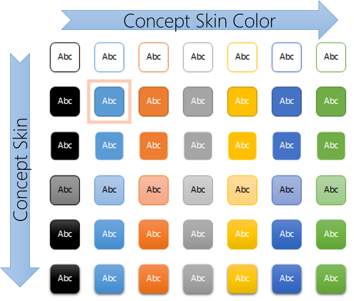 |
A WPF skin is composed of styles, enabling to completely redefine the appearance of a control, his visual structure, shape or colors. In ConceptHmi, we suggest to divide skinning in two concepts: skins and skin colors. Concept skins only define the visual structure of a control, as concept skin colors define the colors used by the skins. These two concepts can be found in various Microsoft Office applications. As an example, we could have a 3D skin and a flat skin, that both uses a variety of skin colors. For this separation to work, the needed skin colors of a skin have to be named and kept well structured, so that other skins can use them too. Therefore, Concept skins can be compatible – or incompatible – with each other’s in terms of skin colors. There is no obligation to follow this suggestion of separation, as normal WPF skins can also be created and used without any issue. They just won’t be compatible with skin-colors oriented skins. |
The creation of a new ConceptHmi skin or skin color can be split into two main tasks:
|
As does WPF for its Themes/Generic.xaml file for custom controls, ConceptHmi also works with naming conventions to automatically discover skins and skin colors in an application or library. |
At the application startup, ConceptHmi parses WPF resources of each new assembly to look for skins or skin colors. All skins and skin colors must then be registered in ConceptHmi during the application startup for this mechanism to work. This mechanism is also used when new assemblies are dynamically loaded during application runtime (see Extending an application via plug-ins).
To register a skin or a skin color in ConceptHmi at application startup, the easiest way is to create a class overriding ConceptBootStrapper in your application (see Starting a new application). ConceptBootStrapper contains a virtual method called LoadCustomSkins() that has to be overriden to register the new skins or skin colors. This method will be called by ConceptHmi at the right moment during the application startup.
The ConceptStyle static class is the ConceptHmi API to manage skin and skin colors. It contains all the methods to register skins (AddSkin() and AddSkinColor()), and can also be used to apply a default skin at startup (ApplySkin() and ApplySkinColor()). The AddSkin Method takes a name and a display name as parameters, and the AddSkinColor Method takes a name and a color. The skin and skin color names will be used by ConceptHmi to find the skin files in each of the loaded assemblies, and therefore act like keys. The skin display name and the skin color color will be used to be displayed in the skin selection editor.
public class BootStrapper : ConceptBootstrapper
{
    #region Consts
    public const string ConceptSkinFlatName = "ConceptSkin.Flat";
    public const string ConceptSkinFlatNameDisplayName = "Flat";
    public const string ConceptSkinColorLightBlue = "ConceptSkinColor.LightBlue";
    public const string ConceptSkinColorDarkGreen = "ConceptSkinColor.DarkGreen";
    #endregion
    protected override void LoadCustomSkins()
    {
        base.LoadCustomSkins();
        ConceptStyle.AddSkin(ConceptSkinFlatName, ConceptSkinFlatNameDisplayName);
        ConceptStyle.AddSkinColor(ConceptSkinColorLightBlue, Colors.LightBlue);
        ConceptStyle.AddSkinColor(ConceptSkinColorDarkGreen, Colors.DarkGreen);
        ConceptStyle.ApplySkin(ConceptSkinFlatName);
        ConceptStyle.ApplySkinColor(ConceptSkinColorLightBlue);
    }
}
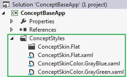
In order to extend a registered skin or skin color with additional resources, files with specific naming conventions have to be added to a WPF-based Visual Studio project. ConceptHmi will look for all loaded assemblies that reference Concept.Utils.Wpf Assembly and contain a root folder named "ConceptStyles". In this folder, ConceptHmi will look for XAML resource files that are named after a skin or skin color previously registered using the AddSkin Method or the AddSkinColor Method.
|
Don't forget to add a reference to Concept.Utils and Concept.Utils.Wpf to any Visual Studio project that bring skinning ressources, even if it is only a skinning library that does not provide new classes. |
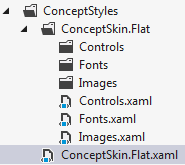
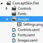
Here's an example of a good skin resource files structure in a project :
|
Place your skin-named XAML resource files in a "ConceptStyles" folder, at the root of your Visual Studio project. |
A skin is often made of many WPF styles separated in different resource files. The suggested structure groups all the resource files linked to a skin in a folder named after that skin. This way the resource file named after the skin, located in the ConceptStyles folder, only references the resource files located in the sub-folder with the same name,
Going further, depending on the skin complexity, the structure can be extended with sub-folders, using the same strategy.
|
For a better skin reusability between applications, a good skin structure is to separate the controls styles between the ones done for the applications controls (limited reusability), ConceptHmi control (good reusability), and WPF controls (best reusability). |
<ResourceDictionary xmlns="http://schemas.microsoft.com/winfx/2006/xaml/presentation"
                    xmlns:x="http://schemas.microsoft.com/winfx/2006/xaml">
    <ResourceDictionary.MergedDictionaries>
        <ResourceDictionary Source="ConceptSkin.Flat/Images.xaml"/>
        <ResourceDictionary Source="ConceptSkin.Flat/Fonts.xaml"/>
        <ResourceDictionary Source="ConceptSkin.Flat/Controls.xaml"/>
    </ResourceDictionary.MergedDictionaries>

</ResourceDictionary>
The interaction between a skin and a skin color is depending on the way both have been coded. The compatibility of a skin and a skin color is only ensured by a good base structure and strict coding principles.
As a rule of thumb, for a skin/skin color scenario to work, no brush should be defined directy in the skin. All the brushes property setters of a skin should always link to a named dynamic resource, that will be defined in a skin color resource dictionary.
Here's an example of a skin for a button compatible with the skin colors defined. This way, the colors of an application can easily be changed without having to redefine any style.
<ResourceDictionary xmlns="http://schemas.microsoft.com/winfx/2006/xaml/presentation"
                    xmlns:x="http://schemas.microsoft.com/winfx/2006/xaml">
    <Style TargetType="{x:Type Button}">
        <Setter Property="BorderBrush" Value="{DynamicResource ButtonBorderBrush}"/>
        <Setter Property="BorderThickness" Value="1"/>
        <Setter Property="Background" Value="{DynamicResource ButtonBackground}"/>
        <Setter Property="Foreground" Value="{DynamicResource ButtonForeground}"/>
        <Setter Property="Padding" Value="2"/>
        <Setter Property="Template">
            <Setter.Value>
                <ControlTemplate TargetType="{x:Type Button}">
                    <Border BorderBrush="{TemplateBinding BorderBrush}"
                            BorderThickness="{TemplateBinding BorderThickness}"
                            Background="{TemplateBinding Background}"
                            CornerRadius="5">
                        <ContentPresenter HorizontalAlignment="{TemplateBinding HorizontalContentAlignment}"
                                          VerticalAlignment="{TemplateBinding VerticalContentAlignment}"
                                          Margin="{TemplateBinding Padding}" />
                    </Border>
                </ControlTemplate>
            </Setter.Value>
        </Setter>
        <Style.Triggers>
            <Trigger Property="IsPressed" Value="True">
                <Setter Property="BorderBrush" Value="{DynamicResource ButtonPressedBorderBrush}"/>
                <Setter Property="Background" Value="{DynamicResource ButtonPressedBackground}"/>
                <Setter Property="Foreground" Value="{DynamicResource ButtonPressedForeground}"/>
            </Trigger>
        </Style.Triggers>
    </Style>
</ResourceDictionary>
<ResourceDictionary xmlns="http://schemas.microsoft.com/winfx/2006/xaml/presentation"
                    xmlns:x="http://schemas.microsoft.com/winfx/2006/xaml">
    <SolidColorBrush x:Key="ButtonBackground" Color="White"/>
    <SolidColorBrush x:Key="ButtonBorderBrush" Color="Green"/>
    <SolidColorBrush x:Key="ButtonForeground" Color="Black"/>
    <SolidColorBrush x:Key="ButtonPressedBackground" Color="Black"/>
    <SolidColorBrush x:Key="ButtonPressedBorderBrush" Color="Red"/>
    <SolidColorBrush x:Key="ButtonPressedForeground" Color="White"/>
</ResourceDictionary>
In many cases, the icons or the fonts of an application are depending on a skin. Here are different ways to integrate external ressources to a ConceptHmi skin. These examples are not directly related to ConceptHmi (more to WPF), but can still be very useful when creating skins.
<ResourceDictionary xmlns="http://schemas.microsoft.com/winfx/2006/xaml/presentation"
                    xmlns:x="http://schemas.microsoft.com/winfx/2006/xaml">
    <BitmapImage x:Key="SettingsImage" UriSource="Images/Settings.png"/>
</ResourceDictionary>

<ResourceDictionary xmlns="http://schemas.microsoft.com/winfx/2006/xaml/presentation"
                    xmlns:x="http://schemas.microsoft.com/winfx/2006/xaml">
    <ResourceDictionary.MergedDictionaries>
         <ResourceDictionary Source="Images/AddIcon.xaml"/>
     </ResourceDictionary.MergedDictionaries>

 </ResourceDictionary>
|
Most of the time, the resource file AddIcon.xaml will contain a DrawingImage, which can be used in the ImageSource property of the Image WPF Control. |
|
A lot of icons are found in SVG format over the internet. Here's a small tool developped by Objectis converting any SVG image in a XAML resource file that can be used in ConceptHmi skins. The tool processes all SVG images located in the selected folder and its subfolder. |
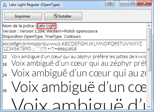
The font must be referenced in the XAML for further use, using its name preceded by "#". An easy way to find the name of a font is by double-clicking on it in Windows.
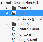
<ResourceDictionary xmlns="http://schemas.microsoft.com/winfx/2006/xaml/presentation"
                    xmlns:x="http://schemas.microsoft.com/winfx/2006/xaml">
    <FontFamily x:Key="DefaultFont">Fonts/#Lato Light</FontFamily>

 </ResourceDictionary>
|
Remember to always put the "#" character in front of the name of the font given by Windows. |
When internationalization is needed in ConceptHmi skin, the Intl markup extension must be used with the Full Key property only. Using the Key property will generate an exception at runtime. For more information on internationalization, see Translating a complete application.